Find It Locally
Search CISA’s online guide to local farms, food, and more!
Find Local Food
Most businesses will find a need for some sort of printed materials, such as business cards, brochures, flyers, or even print advertising. Familiarize yourself with some design basics that can help you lay out your own professional-looking materials, or evaluate designs created for you by a professional.
As with all the marketing strategies contained in this manual, you must begin by considering your marketing goals, opportunities, and resources. Printed materials can be expensive to produce, so consider how you can get the most value out of whatever you choose to print. If you have a CSA, it probably makes sense to print a flyer that has space for some detail about what your shares look like and how people can sign up. If you do events and your business depends on networking, you need a business card.
 These are general tips that can help you to ensure that your print materials are based on solid design concepts. Not every single concept is necessary for a successful print piece.
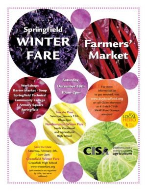
The eye follows a “z” pattern when looking at a page by moving across the top, scanning to the lower left, and then finishing in the lower right. People scan a page and only read more closely if something of interest draws them in. Place important components on the page so that your audience can quickly grasp your primary messages. The CISA ad to the right utilizes this layout: our logo and the headline across the top, an image where the eye sweeps down and towards the right, and then our website information across the bottom, ending with a specific call to action at the bottom right.
Everything on the page should align with something else. Use a grid as a guide, and break alignment only for emphasis. Note that the CISA logo at the bottom of the ad aligns with the headline at the top, and each section has text oriented to the left, rather than centered.
Pages can be divided horizontally or vertically into thirds for an appealing layout. The CISA ad to the right uses this rule to good effect. This rule also applies to photographs.
A simple way to ensure a pleasing layout is to rely on one strong visual element. Pairing one strong image with a large headline and some explanatory text is a classic arrangement for print materials. People also like seeing images of people, so include a person if it makes sense to do so and make sure their eyes are visible. The CISA ad above uses one primary image of a person to catch readers’ eyes. A bad example This draft poster is an example of a design that does not adhere to the design principles, so the result is visually confusing.
 A Bad Example
This draft poster is an example of a design that does not adhere to the design principles, so the result is visually confusing.
All of the colors in your print materials should be consistent with any other outreach materials. The color of the green bands in the CISA above is consistent with the green that CISA consistently uses in its logo, mailings, website, signage, and so on. When selecting colors, it is important to understand the subtle messages that the public receives from each color. Consider the emotional response you want to trigger in your audience and choose colors that sync with your brand.
Use images that tell a story. Photographs are powerful, and readers respond well to images of people. Think before you print about the size of the piece and the print quality you are able to afford. Very small pieces (like “mini-ads”) or materials that you will be printing at home in black and white may not benefit from the use of photographs. Images, like page layout, are more visually interesting when you apply the “Rule of Thirds.” Imagine that your image is divided into thirds along the horizontal and vertical axes, and place the focal point at the intersections of those lines. A focal point may be the eyes of the person in the image, for example.
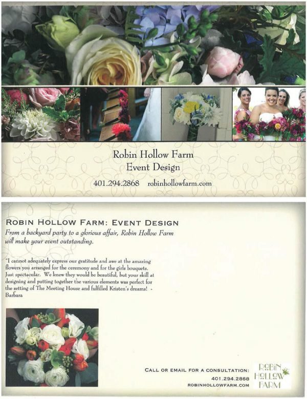
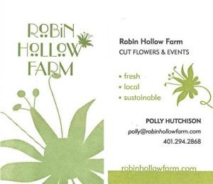 Because events are a significant component of their business, it is important that Robin Hollow Farm have compelling and professional printed materials. Polly says, “Farmers’ markets are, in and of themselves, good marketing.” Polly has two business cards: one is a sophisticated letter-press card, and the other is a small, colorful mini Moo Card (half the size of a regular business card). She also has a glossy, half-sheet postcard that is geared specifically towards marketing Robin Hollow Farm’s event services. The postcard and the Moo cards are out at the farmers’ markets, and she hands out any of the three pieces during networking opportunities.
The elegant letterpress business card uses a major design element from the Robin Hollow Farm logo in fresh ways. The colors mimic the colors on the website, and the “Fresh – Local – Sustainable” tagline is used.
Polly has several different versions of the mini Moo card – this is just one example. Here, too, the floral design from the logo is in black and white on the back, and both taglines are used:


This material is based upon work supported by USDA/NIFA under Award Number 2010-49200-06201.
In accordance with Federal law and US Department of Agriculture policy, this institution is prohibited from discrimination on the basis of race, color, national origin, sex, age, or disability. (Not all prohibited bases apply to all programs.)
To file a complaint of discrimination, write USDA, Director, Office of Civil Rights, 1400 Independence Avenue, SW, Washington, DC 20250-9410, or call (800) 795-3272 (voice), or (202) 720-6382 (TDD).